Logo Design
Logo Design
When you’re starting up your business or rebranding, logo design is exciting yet can be daunting. There’s also the ever-present concern of cost. How on earth are you going to get what you want with a small business start-up budget?
Your Brand Is Everything!
Firstly, let’s tackle cost.
I’ve worked with agencies large and small and can absolutely assure you we deliver the same exceptional quality and professionalism (if not better!) at vastly reduced rates. Having said that, you don’t want to hop online and pay $49 for a logo. It’s a balance of finding a decent budget to get everything you need and love from the get-go, but not exorbitant pricing that will blow your budget and cash flow.
Logo Design
I’ve been through this process myself. In 2010 I was at the thrilling point of getting a logo designed with no idea of budget, let alone having a plan for how much to invest. But I’ve never looked back! My logo lasted 13 years with a redesign. Now that’s a good investment! Get it right from the outset and you’ll have something that lasts for years.
Get All The Right Assets
I’ve worked with a number of small businesses that have gone with a super-cheap logo design option which they have had to get redone:
- Because the design was awful.
- They weren’t delivered all the right file formats for digital and print, let alone a style guide.
It’s a time-consuming and disappointing process during a time where you can well need extra assurance and guidance as you launch your business or rebrand.
Insignia Crew – One Year Old Business
The lovely new Insignia Crew logo design is quite geometric and abstract. It uses the Insignia ranking / symbol and also depicts key elements and qualities such as premium, classic, unity and rankings. Have a read of the Case Study which takes you through the background for this project.
Grey Matter – New Business Launch
A beautiful, quite simplified graphic logo for a startup business in concrete repair, Grey Matter Concrete Solutions. The abstract G and M, with the M being made up of lines, represent a reinforced concrete structure in an abstract way.
Trash Talk
The brief for Trash Talk? To create an 80’s retro logo: think neon signs, Miami Vice, Cocktail – Tom Cruise, Men at Work, 80’s American sitcoms.
Hearts Desire Homewares – Established Business
Hearts Desire Homewares has been established for many years and are a very successful business through their pop-up stores. We built them a new website to drive online sales but they didn’t have a proper logo, just their brand name in a standard font.This new logo was developed to give them a proper brand identity. It is fun and playful and we provided them with five versions using different colours for the heart: coral, black, turquoise, peach, and navy.
Earth Saltz – New Business
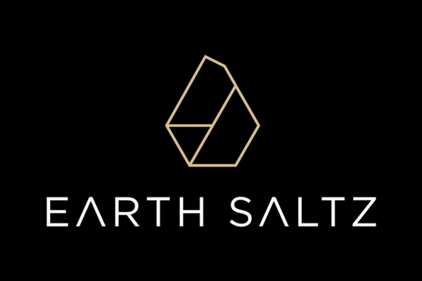
Earth Saltz had a logo designed for the website we built, but the font and colour really jarred with it.Thankfully we had the opportunity to design a new one and this is the outcome!This design draws inspiration from the beautiful natural Himalayan salt products by crafting a unique geometric symbol, abstractly drawn from the natural-shaped lamps. The A’s in the typography are simplified to represent the Himalayan mountain peaks.
Creative Nature Landscapes – Established Business
Creative Nature Landscape Services is a very established business but their logo was designed about ten years ago. When we came to build the new website we didn’t have any workable files, so we recreated the logo with a slight design tweak bringing the text in line. They now have all the proper file formats for stationery, clothing, trucks and website i.e. digital and print.
Get in touch with your design brief, we’d love to help!
